

ModEgg is an investment firm focused on real estate investing for professionals who work within the real estate industry. Created to address the ironic paradigm that most real estate agents are not investing in their own industry, ModEgg needed a professional, trusting brand identity. We did not, however, want ModEgg to get lost in the dry, often boring branding of the financial world, so we focused on fun colors and hand drawn graphics, while staying elevated and simple.
What I Did
Brand Look & Feel
Logos, Colors & Typography
Art Direction
Designed & Built Website
Designed Business Cards, Letterheads, & Slide Decks
Designed & Printed Brand Books
Who I Worked With
CEO, ModEgg
COO, ModEgg
Artist for Hand Drawn Graphics

Purposeful Design, Careful Alignment
The main logo was created to connect the name of the brand to the meaning & mission of the brand, the Modern Nest Egg. Along with the tagline, the imagery of an egg, literally within a house, connects to the purpose.

Simple, Modern Colors and Typography
After rounds of color exploration, we settled on these colors. We wanted a main dark grey that could be used in professional, financial settings, while having the freedom to pop in accent colors as needed.
Here are a couple examples of the color exploration.


Brand Graphics & Imagery

We had an initial problem to solve regarding the graphics and imagery for the brand. With the clean, modern feel of ModEgg, it would make sense to use high-end, luxury homes. However, showcasing beautiful, modern interiors and exteriors doesn’t really fit, since most of the actual investing done by ModEgg are not these types of homes.
We settled on a hand drawn style, wanting to show both interior and exterior drawings of homes. This worked well, especially for the cover of the brand book above, where featuring multiple properties adds to the Modern Nest Egg message, where a portfolio of investment properties is a literal investment nest egg!

I even had our artist draw the Executive Team instead of using headshot photos!

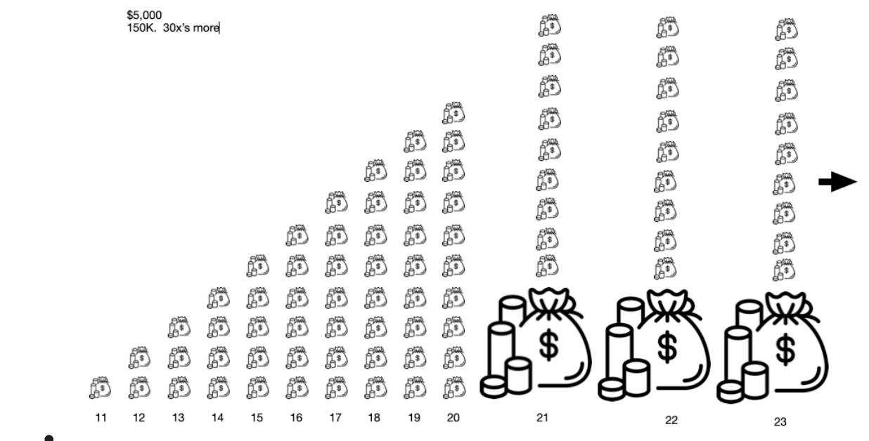
Infographics, Data Visualization, & Icons

There were many graphics I was tasked with making based off of the data, ideas, and drawings from the ModEgg executive team. Some of them showcased complicated information over long periods of time, so I worked to simplify them to be as clean and easy to comprehend as possible.
Examples of iterations on the Cash flows & Distributions Infographic
The original ‘mockup’ the ModEgg Team provided me

This was an early spread of the infographic

An expanded idea with the ModEgg team’s edits - almost there!

The final artwork! Used in the Brand books, Agent Brokerage books, Pitch Decks, & more.

On the artwork for this spread of the Brand Book, I used branded icons, and re-iterated the egg motif in the Fund Model infographic.
White Labeling for Brokerage Partners

ModEgg partners directly with major real estate brokerages.
Once partnered, I create white labeled branding and materials for each brokerages’ investment fund, which has the product name Nest.
These materials include full white labeled books that are given to all the agents in the brokerage. I’d love to discuss these further, but due to proprietary information I can’t feature them here!
ModEgg Website

ModEgg needed a digital presence and a website. Since they partner directly with brokerages, they did not need to portray any specifics of what they actually do, and they did not want too many individual leads coming in. Based on that, I created a simple scrolling website that hit the high level points of what makes them unique. There is an ability to contact, but no hard CTA’s to push potential leads.